The Day I Realized Color Was Magic
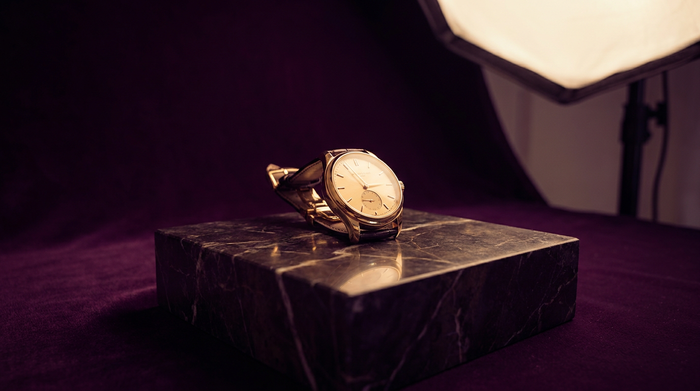
I'll never forget the espresso martini fiasco of 2019. A premium spirits client insisted their new ready-to-drink cocktail needed "classy black packaging" - until we A/B tested it against a deep aubergine purple. The purple outsold black 3:1 in focus groups. "It feels more indulgent," one participant said, swirling the purple can like fine wine. That's when I truly understood: color isn't just decoration - it's silent salesmanship. Through 12 years of branding projects, I've seen how strategic color choices can increase perceived value by 40%, boost conversion rates by 15%, and even alter taste perception (yes, really).
Why Colors Speak Louder Than Words
Neuroscience shows color reaches the brain 60,000x faster than text or shapes. When you see Coca-Cola red, your brain doesn't process the letters first - it feels the energy and excitement before you've read a word. But here's what most marketers miss: color psychology isn't universal. While Western cultures associate white with purity, in parts of Asia it symbolizes mourning. I learned this the hard way when a wedding client's ivory invitations offended her Chinese in-laws.
Pro tip: Always test colors with your specific audience - I once had to scrap an entire green wellness campaign because our Middle Eastern test group associated the shade with poison.
The Brand Color Hall of Fame
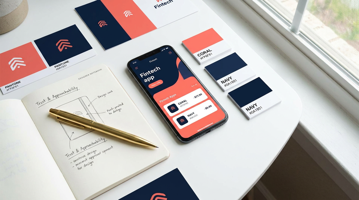
Let's analyze why these colors dominate their categories: Tiffany blue (luxury), McDonald's yellow (urgency), Whole Foods green (natural). Blue dominates tech (Facebook, LinkedIn) because it projects trust - but notice how Slack uses a playful palette to stand out. For a fintech startup last year, we blended navy (trust) with coral (approachability) - their app downloads jumped 34% versus competitors' sterile blue schemes. I think the future belongs to duotones - like Glossier's millennial pink meets stark white - which create ownable color "signatures."
I remember rebranding a struggling juice company. Their original lime green screamed "cheap" to focus groups. We created a custom "ripe mango" orange that made people say "I can taste the freshness" - sales doubled in 6 months. That's the power of appetite-stimulating colors in food marketing.
The Science of Implementation
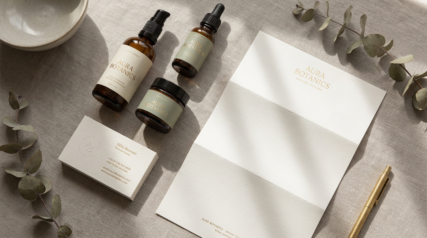
Your hero color should appear in 60% of branded assets for recognition. But here's where brands fail: they don't consider color hierarchy. Primary (logo), secondary (accent), and tertiary (background) colors need defined roles. When we redesigned a skincare line, we used:
- Serene lavender as primary (calming)
- Mint green secondary (refreshment)
- Pearl white tertiary (purity)
The result? A 28% increase in "makes me feel relaxed" survey responses. Always test colors in context - that perfect emerald looks different on Instagram vs. Amazon vs. billboards. I use Clairlook's virtual staging to test product colors against lifestyle backgrounds before photoshoots - it's saved me countless packaging missteps.
What I've learned: Never choose colors in isolation. View them on your actual packaging, website headers, and social templates before finalizing.
Color Fails to Avoid
Early in my career, I used bright yellow for a meditation app - users complained it felt "anxious." Another pitfall: trendy colors that date quickly (remember 2017's millennial pink overload?). For longevity, anchor your palette with a timeless base (navy, charcoal) and add trend colors as accents. And never underestimate cultural context - a client's "confident" red sports drink flopped in South Africa where that shade is associated with mourning.
I once worked with a vegan bakery that insisted on brown packaging to seem "natural" - until we proved through testing that soft pastels made their treats look more appetizing (and increased impulse buys at checkout by 19%).
Your Color Mastery Action Plan
Start by auditing competitors' colors - then intentionally differentiate. If every bank uses blue, could sage green position you as the "eco-friendly" choice? Conduct simple A/B tests: change just one color element (like CTA buttons) and measure impact. For e-commerce, use tools like Clairlook to mock up products in different colorways against lifestyle scenes - I've seen conversion rates swing 20% based on background colors alone.
Remember, color is your silent brand ambassador. That coral lipstick packaging isn't just pretty - it whispers "playful confidence" before the customer reads a word. Your challenge? Stop choosing colors you "like" and start selecting hues that work. Because in branding, the right color isn't decoration - it's strategy made visible.
Comments (0)
Please sign in to leave a comment.