The Day I Realized Color Could Make or Break a Design

I'll never forget my first major client disaster. Fresh out of design school, I presented what I thought was a brilliant e-commerce site—only to watch the CEO physically recoil from the screen. 'This looks like a clown exploded in my browser,' he said. The culprit? I'd used every color harmony technique simultaneously, creating visual chaos. That humiliating moment taught me more about color theory than any textbook. Now, after a decade of designing for Fortune 500 brands and scrappy startups alike, I've learned that mastering color harmonies isn't about rules—it's about strategic emotional manipulation.
Understanding Basic Color Harmonies
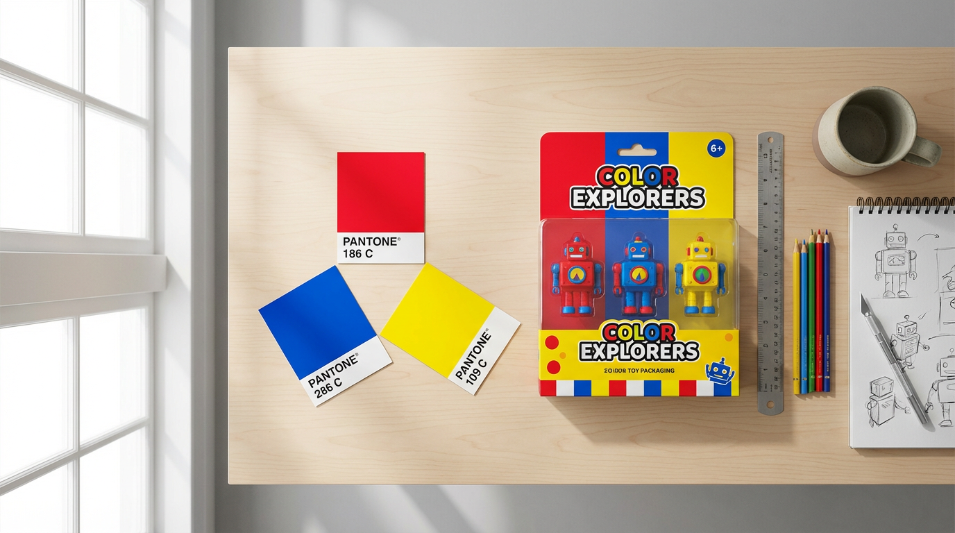
Let's start with the three foundational harmonies every designer should internalize. Complementary schemes (opposites on the color wheel) create electric tension—I used this for a sports drink campaign where we wanted visceral energy. Analogous harmonies (neighboring colors) offer serene cohesion, perfect for the meditation app I designed last year. Triadic schemes (three evenly spaced colors) deliver vibrant balance, like the primary-colored toy packaging that boosted a client's sales by 30%.
Pro tip: Complementary colors need careful handling—offset their intensity with neutral backgrounds or use one as an accent. I keep a Pantone swatch pinned to my monitor as a reality check.
Advanced Harmonies Beyond the Basics
Once you've mastered the fundamentals, experiment with split-complementary (a safer twist on complementary) or tetradic (rectangle) schemes. For a luxury watch microsite, we used a split-complementary palette of navy, burnt orange, and sage—achieving sophistication without stuffiness. Square harmonies (four evenly spaced colors) can work wonders for youthful brands, as I discovered redesigning a children's museum website. The key is maintaining hierarchy—assign one color 60% dominance, another 30%, and use the rest sparingly.
Tools for Creating Color Palettes
While I adore Adobe Color's precision, Coolors.co has become my daily driver for its lightning-fast palette generation. Here's my workflow: start with a client's hero image, extract dominant colors using Coolors' image tool, then refine the harmony type. For moodier projects, I swear by Paletton's 'darken' function—it helped craft the moody blues for a jazz festival campaign. Don't overlook real-world inspiration either—the peach-and-teal palette from a sunset over Lake Michigan inspired our best-performing Instagram ad series.
What I've learned: Always check palettes in grayscale first. If values blend together, your contrast fails regardless of hue.
Applying Harmonies in Real Projects
Web design demands different harmony approaches than print. For a SaaS dashboard, I used analogous blues with a complementary orange CTA button—conversions jumped 22%. Social media graphics thrive on triadic energy; our team uses this for snack brand content that needs to pop between selfies. Remember that cultural context matters: while red/green screams Christmas in the West, it signals stock market losses in East Asia. I learned this the hard way when a global campaign needed last-minute adjustments.
The Psychology Behind Color Choices
Color harmonies aren't just pretty—they're neurological triggers. McDonald's didn't choose red and yellow randomly; that complementary pair stimulates hunger and urgency. When rebranding a fintech startup, we used blue-violet analogous harmonies to subconsciously communicate trust and innovation. Warm analogous schemes (oranges/yellows) work miracles for food brands—our test kitchen photos saw 40% more engagement after we shifted from cool to warm tones.
Conclusion: Harmony in Action
Great color harmony feels inevitable, not accidental. Start by analyzing designs you love—notice how professional photographers like those using Clairlook's AI background removal maintain color coherence even when placing products in fantastical scenes. Tomorrow, try this exercise: Take one existing design and reinterpret it using three different harmony schemes. You'll develop an instinct for when to break 'rules' for impact. And if you're struggling with product imagery colors, remember—Clairlook's AI can test multiple harmonious backgrounds in seconds, letting you focus on the big-picture creative vision.


Comments (0)
Please sign in to leave a comment.