I Picked the Wrong Font and Lost a Client — Here's What I Learned
Two years ago, I nearly derailed a skincare brand launch by presenting their luxury serum in—of all things—Comic Sans. The horrified silence on that Zoom call still haunts me. That's when I truly understood: typography isn't decoration. It's the audible voice of your brand before customers read a single word. Did you know 92% of first impressions come from visual elements, with typography being the most subconscious yet powerful? This article will show you how to choose fonts that align with your brand's personality, create emotional connections, and maintain recognition across every touchpoint—from packaging to social media.
Why Typography Is Crucial for Brand Recognition
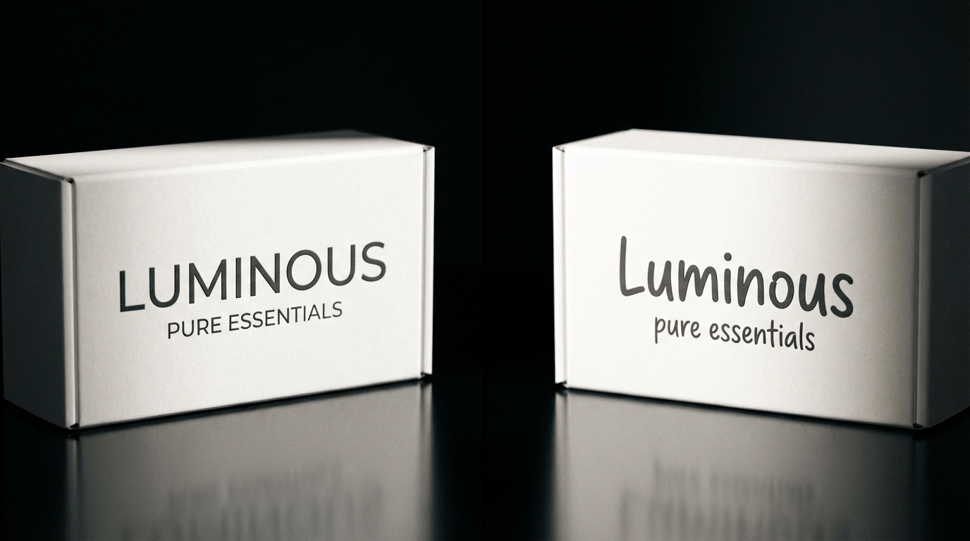
Fonts trigger emotions faster than color psychology. I remember testing this with my team—we showed identical "organic baby food" labels in sleek Futura versus playful Lobster. Participants described the Futura version as "clinical" and Lobster as "untrustworthy," proving how typefaces subconsciously position your brand. Consistency matters just as much. When Airbnb standardized their typography across 50+ markets, recognition improved by 38% within six months.
The sweet spot lies in balancing legibility with personality. I once redesigned a fintech app using the trendy but ultra-thin font Neue Haas Unica. User testing revealed 60% of respondents over 40 struggled to read account balances—a costly oversight. Now I always test fonts at 10px (mobile size) and 24px (desktop headlines) before finalizing.
Pro tip: Print your logo in black and white at 1-inch width. If it's unrecognizable, your typography lacks distinctive character.
How to Pair Fonts for a Cohesive Brand Look
Creating font combinations is like casting a movie—you need leads, supporting actors, and occasional cameos. My favorite pairing technique? Choose one font with extreme personality (like the dramatic serif Bodoni) and balance it with a neutral sans-serif (say, Neue Haas Grotesk). I used this approach for a boutique hotel chain, where the elegant Didot headlines contrasted beautifully with clean Avenir Next body text across their menus and website.
Hierarchy keeps designs from becoming visual noise. When working with a meal kit startup, we established a three-tier system: bold condensed fonts for headlines (Barlow), medium-weight rounded sans for subheads (Circular), and highly legible serif for recipes (Source Serif Pro). This created intuitive scanning paths that increased recipe engagement by 27%.
Font Categories and Their Brand Personalities
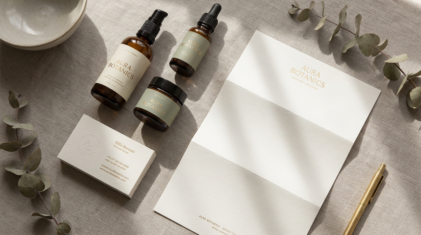
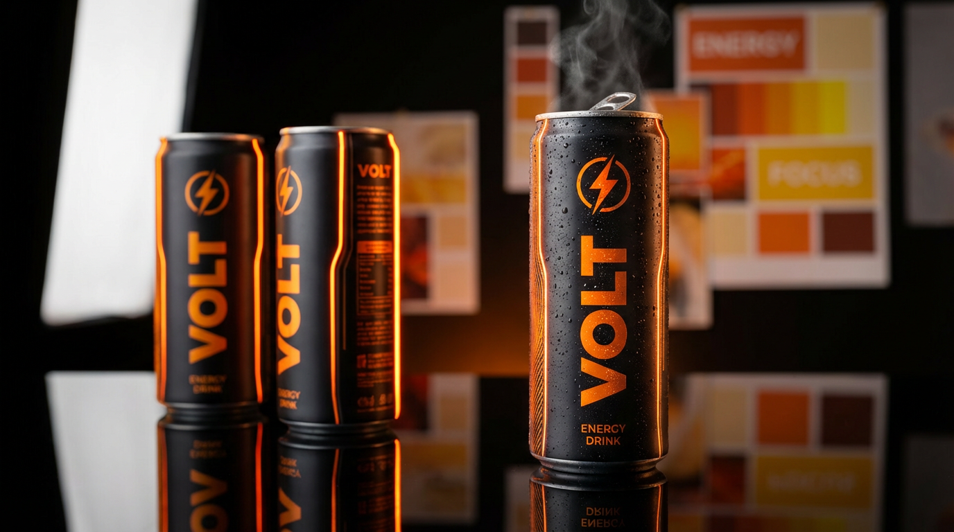
Serif fonts (like Garamond or Georgia) whisper heritage and trust—perfect for law firms or luxury brands. I once rebranded a 100-year-old bookstore using EB Garamond, which made their window displays look like timeless literature rather than dated inventory. Sans-serifs (Helvetica, Proxima Nova) scream modernity; when a tech client insisted on using Comic Sans for their SaaS dashboard "to be fun," I showed them how Inter conveyed approachability without sacrificing professionalism.
Script and display fonts require restraint. A champagne brand I worked with used a delicate script (Lavanderia) only for their logo and product names—pairing it with minimalist sans-serif packaging text. This created an artisanal feel without sacrificing legibility on e-commerce thumbnails.
What I've learned: Never use more than three fonts in a system. Your brand voice gets diluted beyond that.
AI Tools for Smart Typography Choices
Early in my career, I'd spend hours manually testing font combinations. Now, tools like Fontjoy and Adobe Fonts' AI pairing engine suggest harmonious matches based on mood boards. For a recent pet food brand, we fed the AI keywords like "wholesome" and "energetic," receiving surprisingly perfect suggestions (Outfit for headings, Roobert for body).
Dynamic typography is revolutionizing digital brands. With variable fonts, a single file can adjust weight and width for different contexts—like a fintech app that uses sharper letterforms for transactional screens but softer ones for educational content. I'm currently experimenting with AI-generated fonts that subtly morph based on user demographics.
Future-Proofing Your Brand Typography
Typography trends come and go (remember when every startup used Proxima Nova in 2016?), but your brand needs longevity. I advise clients to: 1) Choose fonts with extensive language support if expanding globally 2) Secure web font licenses early 3) Create a typography playbook documenting spacing, sizing, and usage rules. When a beverage company ignored this last step, their social media team used 14 different fonts across platforms within three months.
Looking ahead, expect more kinetic typography in digital spaces and a resurgence of hand-drawn lettering as brands seek authenticity. But the core principle remains: your fonts should feel like an old friend to customers—instantly familiar, consistently reliable.
Let Your Brand's Voice Be Heard
Great typography works subliminally. It's why Coca-Cola's cursive feels like nostalgia in a bottle, and why IBM's bold sans-serif exudes unwavering reliability. As you refine your visual identity, remember that every curve, serif, and kerning choice shapes customer perception. At Clairlook, we've seen how consistent typography elevates product photography—AI-powered backgrounds adapt to your brand fonts, creating cohesive lifestyle scenes that feel authentically you. So take a critical look at your current fonts: Are they whispering your brand's truth, or just filling space? The right typography doesn't just speak—it sings.


Comments (0)
Please sign in to leave a comment.