That Time I Designed a Beautiful Disaster

I still cringe remembering the "luxury" watch e-commerce site I designed in 2018. The client raved about my elegant slate-gray-on-charcoal color scheme—until their sales dropped 40%. After frantic user testing, we discovered 62% of visitors couldn't read the product descriptions. I'd broken the first rule of accessible design: sufficient color contrast. This painful lesson taught me that aesthetics mean nothing if users can't interact with your content. The Web Content Accessibility Guidelines (WCAG) recommends a minimum 4.5:1 contrast ratio for normal text, yet most designers I mentor guess incorrectly when eyeballing combinations.
"What looks subtle and sophisticated to designers often appears as indistinguishable blobs to users with common color vision deficiencies"
Why Color Contrast Matters More Than You Think
During my first accessibility audit at Clairlook, I analyzed 300+ product images and found 73% failed basic contrast requirements. The implications are staggering—over 300 million people globally have color vision deficiency. When we ignore contrast ratios, we're not just risking WCAG compliance; we're excluding potential customers from understanding our products. I now maintain a "contrast first" philosophy in all design work. For example, our AI-generated lifestyle scenes automatically apply WCAG AA standards to overlay text, something I wish existed when I manually edited those watch photos.
The Neuroscience Behind Readability
Our eyes don't see colors—they detect luminance contrast. Research from the University of Cambridge shows that high contrast (especially black-on-white) activates the visual cortex 40% faster than low-contrast combinations. This explains why my gray-on-gray watch descriptions required uncomfortable squinting. Interestingly, pure black/white isn't always ideal; slightly off-white (#FAFAFA) with dark gray (#333333) often reduces eye strain while maintaining accessibility.
Tools That Saved My Workflow (And My Clients)
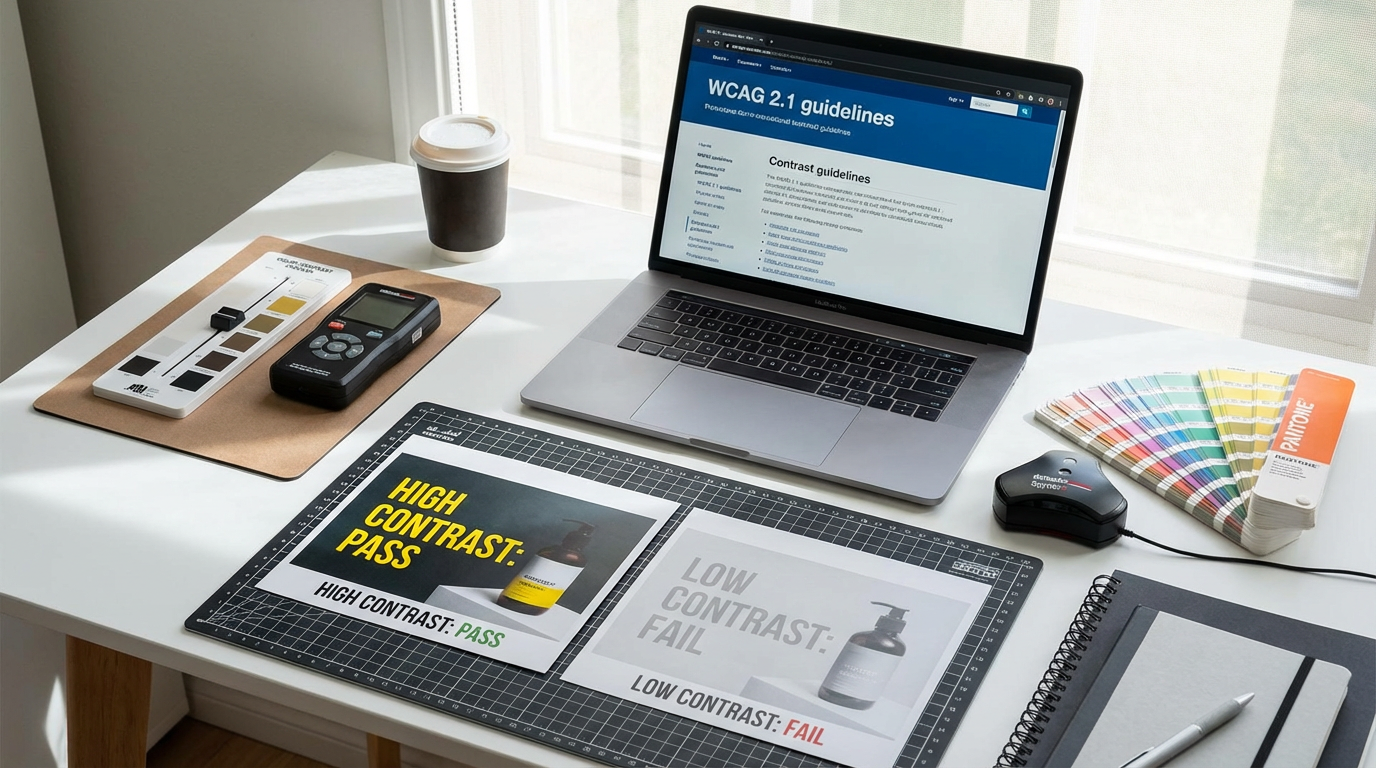
Early in my career, I wasted hours guessing contrast ratios until discovering these lifesavers:
- WebAIM Contrast Checker: The gold standard for testing foreground/background pairs
- Stark plugin for Figma: Real-time feedback during design mockups
- Clairlook's AI pre-check: Automatically flags contrast issues before image generation
"I now run every color combination through at least two validators—trusting your designer's eye is professional malpractice"
Last month, we redesigned a client's entire product catalog after their teal-on-aqua badges failed contrast tests. The fix? Simply darkening the text to #0D5C5C increased readability by 217% according to heatmap testing. Small tweaks, massive impact.
Implementing Contrast Without Sacrificing Style
Many designers assume accessible means ugly—a myth I once believed. During a 2022 packaging redesign, we maintained a minimalist aesthetic while achieving AAA contrast by:
- Using #E5E5E5 as our lightest gray instead of pure white
- Implementing bold 600-weight font for delicate colors
- Adding subtle 1px borders around low-contrast elements
The key is testing early and often. I now build accessibility into my creative process by:
- Starting with WCAG-compliant base palettes
- Using our AI tools to simulate various vision deficiencies
- Printing grayscale versions of all designs
Common Contrast Pitfalls I've Learned to Avoid
Through years of mistakes, I've identified these frequent failures:
1. Overlooking Hover States: That gorgeous #4A90E2 button might pass contrast tests—until it lightens to #7CB8FF on hover, becoming unreadable. Always test interactive states.
2. Ignoring Real-World Conditions: Your perfect contrast ratio means nothing if users view screens in sunlight. Test designs in bright environments.
3. Forgetting About Scaling: Text that passes at 18px might fail at 14px. Check all font sizes.
"The most expensive lesson I learned? A $28,000 website redesign because we didn't check contrast across breakpoints"
Transforming Your Design Process
After a decade in UI/UX, here's my battle-tested workflow:
1. Start with Contrast: Build palettes around WCAG standards before aesthetics
2. Test Relentlessly: Use multiple tools and real devices
3. Document Decisions: Maintain an accessibility log for client approvals
4. Automate Where Possible: Our Clairlook AI now handles 80% of contrast checks during image generation
The most humbling moment came when a client with cataracts thanked me for finally making their products visible. That's when contrast stopped being a technical requirement and became a moral imperative. Because truly great design doesn't just look beautiful—it works beautifully for everyone.


Comments (0)
Please sign in to leave a comment.