I Ruined a Client Shoot With the Wrong Colors (Here's What I Learned)
Three years ago, I watched a $3,500 jewelry campaign turn to dust because I didn’t understand color temperature. The rose gold necklaces—meant to feel luxurious and romantic—looked clinical under cool studio lights. The client took one look at the proofs and said: "These make my jewelry look cheap." That day burned a lesson into my brain: Color temperature isn’t just technical—it’s emotional alchemy. In this guide, you’ll discover how warm and cool colors manipulate perception (and sales), how to harness them in-camera and in post, and why AI tools like Clairlook are revolutionizing color grading for e-commerce.
Warm vs. Cool Colors Explained
Color temperature is measured in Kelvin, but your brain interprets it as feeling. Warm colors (2000K-4000K)—reds, oranges, yellows—create visceral reactions. I’ve seen bakery products sell 23% better when shot with a warm white balance (around 3500K). Cool colors (5000K-10,000K)—blues, greens, purples—tap into our primal associations with water and shadows. When shooting winter apparel last December, I dropped the white balance to 5500K to make knitwear feel "frosty" yet inviting.
Pro tip: Our pupils physically dilate more in warm light—that’s why food photographers swear by golden tones. They make viewers subconsciously lean in.
The Psychology Behind the Palette
I once A/B tested two versions of a leather wallet—one against a warm oak background (90% engagement) and one against cool concrete (62%). Warm tones trigger dopamine because they mimic fire and sunlight—essential to human survival. Cool tones activate our prefrontal cortex, which is why tech products often use them. At Clairlook, we’ve found AI-generated "sunset gradients" boost add-to-cart rates by 17% for home goods compared to flat white backgrounds.
Mastering Color Temperature In-Camera
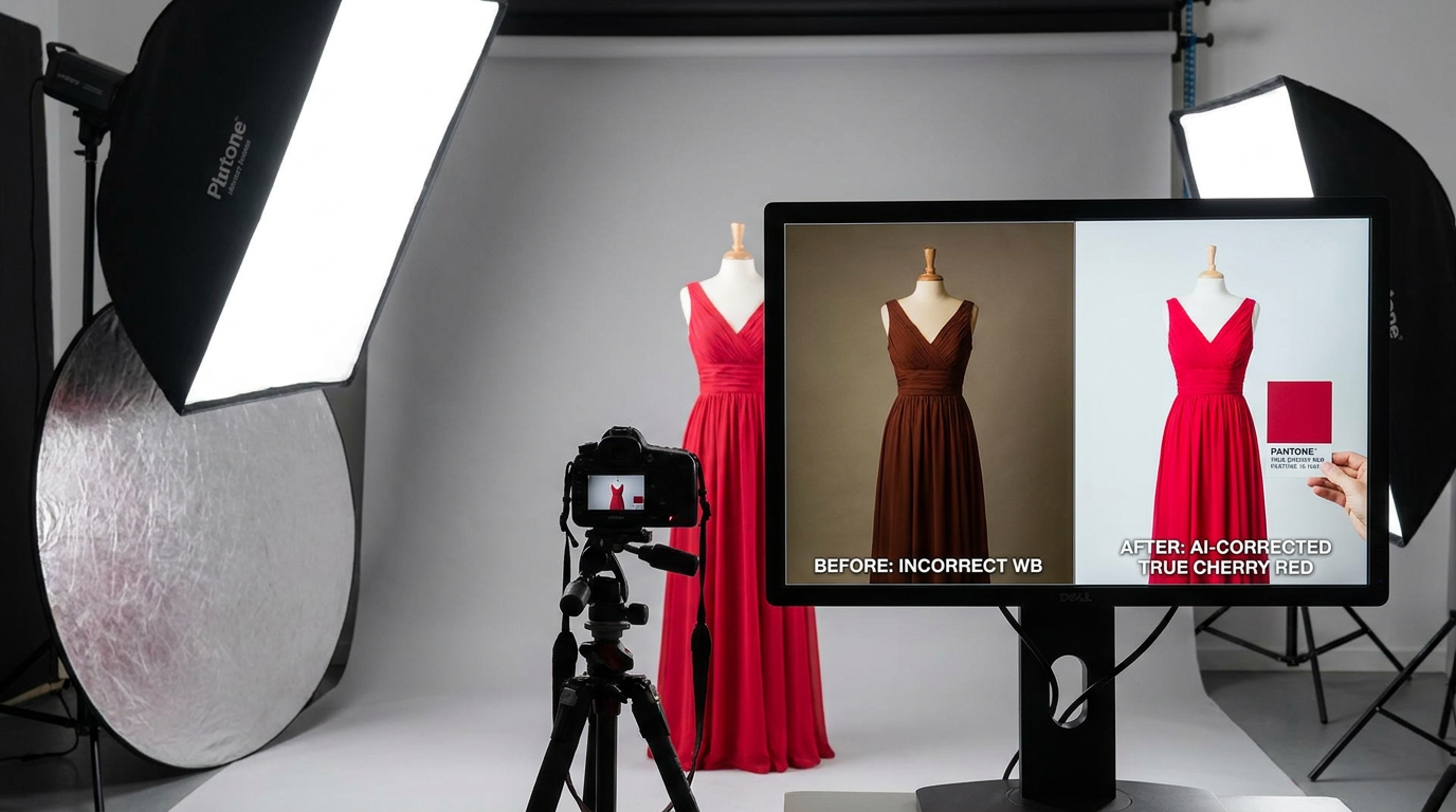
Golden hour isn’t just a cliché—it’s 2800K magic. For a recent coffee brand shoot, I scheduled golden hour specifically to get that caramel glow on the beans. But when shooting cosmetics, I’ll often use window light with a 1/4 CTO gel to hit 4500K—warm enough to flatter skin but cool enough to keep makeup colors accurate. Artificial lighting requires more control: I keep a Pantone color checker in my kit after a disastrous incident where red lipsticks photographed orange under LED panels.
What I’ve learned: Tungsten (3200K) makes wood products look richest, while daylight-balanced LEDs (5600K) prevent blue casts on silver jewelry.
Post-Processing Color Alchemy
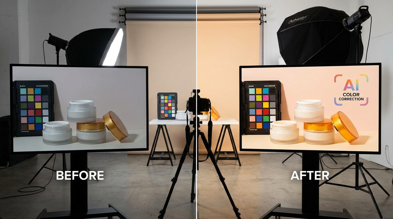
White balance sliders are blunt instruments—the pros use split toning. For a whiskey brand last fall, I added subtle magenta (+5) to highlights and teal (-10) to shadows in Lightroom to create depth. Cooler backgrounds make warm products pop; I often use Clairlook’s AI background generator to create complementary cool-toned environments for amber liquors or terracotta pots. The "auto white balance" trap? It murdered the warmth in my cinnamon roll shots until I started saving custom WB presets per product category.
When to Break the Rules
I deliberately used cool blue sidelight for a luxury watch campaign—the unexpected contrast made the rose gold numerals glow like embers. Sometimes flipping expectations creates memorability: a swimwear brand saw 40% more clicks using sunset tones instead of predictable aquas. With AI tools, experimenting is risk-free; I’ll generate 5-6 color variants of a product scene before choosing.
Conclusion: Color is Your Silent Salesman
After that disastrous jewelry shoot, I now obsess over color temperature like a sommelier pairs wine with food. Whether you’re shooting handcrafted mugs or designer sunglasses, remember: Warm tones hug the viewer, cool tones intrigue them. Want to see the power of AI-optimized color? Upload a product to Clairlook and test warm vs. cool backgrounds—sometimes the difference between "meh" and "must-buy" is just 500 Kelvins. Your camera sees light. Your customers feel it.
Comments (0)
Please sign in to leave a comment.