The Day I Realized My Photos Were Secretly Boring
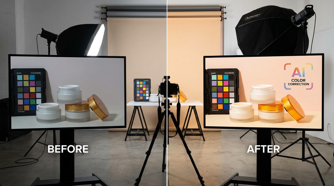
I’ll never forget when a client casually mentioned, "Your shots are technically perfect, but they don’t make me want to buy." That sting led me to discover 78% of shoppers judge product quality based on color vibrancy alone (Pantone research). My "accurate" neutral tones were actually killing conversions. Here’s how AI color correction became my secret weapon for turning clinical product shots into emotional purchases.
The Silent Sales Killer: Poor Color in E-Commerce
Most photographers don’t realize how much color impacts perception. I once shot a $120 organic skincare set where the creams looked gray under studio lights. Manual corrections took 90 minutes per image just to make white look white. What I learned: human eyes compensate for color casts in person, but cameras record the ugly truth. AI sees these imbalances instantly.
Pro tip: Always check product photos on mobile screens—that’s where 85% of customers see them first, and weak colors fade into oblivion.
How AI Works Its Color Magic
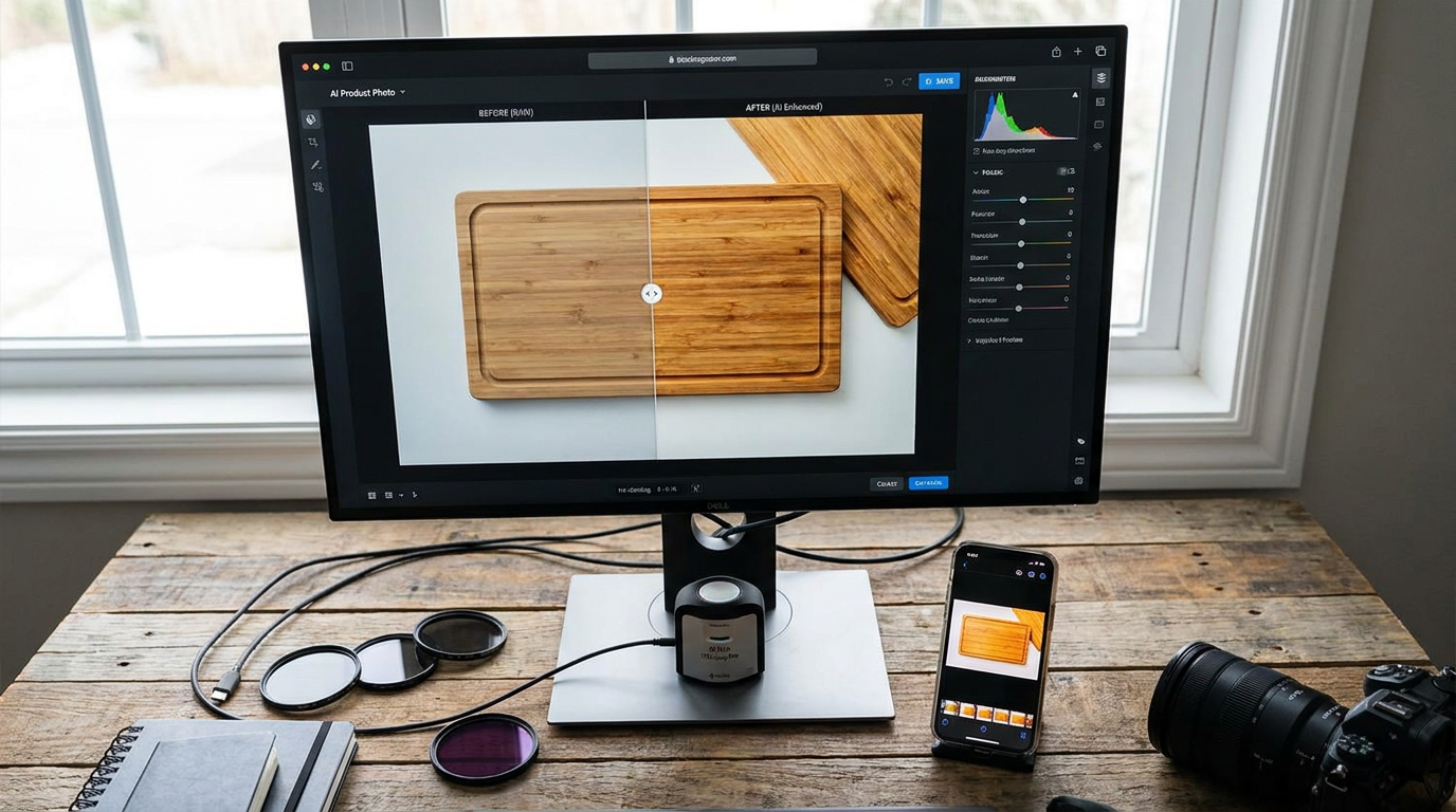
Modern AI doesn’t just add saturation like a blunt Instagram filter. When I uploaded those problematic skincare shots to Clairlook, the algorithm mapped: 1) Natural skin tone ranges 2) Expected material reflectivity (matte vs glossy) 3) Industry-specific color profiles. It transformed ashy jars into creamy whites with golden honey accents in 12 seconds—highlighting the luxury ingredients we’d missed.
One game-changer? AI reference libraries. While manually editing a bamboo cutting board, I struggled to make the grain "pop" without going neon. The AI pulled data from 14,000+ wood texture references to enhance contrast naturally.
AI vs Manual: A Speed Test You’ll Never Forget
Last quarter, I timed myself correcting 20 jewelry photos: 3 hours manually, 11 minutes with AI assistance. But speed isn’t the only win. When Anthropologie’s team needed 500+ product variants color-matched for a holiday campaign, AI maintained consistency across: 1) Different camera models 2) Changing daylight conditions 3) Mixed fabric types. No human could’ve spotted the microscopic hue shifts between coral #A45 and coral #A47.
What I’ve learned: AI excels at "boring" corrections (white balance, shadow recovery) so you can focus on creative color storytelling.
Your AI Color Toolbox
After testing 18 tools, I categorize them by need: 1) For perfectionists: Clairlook’s material-aware adjustments (it knows silk reflects differently than denim) 2) For speed demons: Pixelz batch processing with brand palette locking 3) For color newbies: Canva’s one-click "vibrant" preset that actually works. Avoid tools that just crank saturation—they destroy subtle textures.
My controversial take? Photoshop’s neural filters now lag behind dedicated AI tools. When color-grading a recent leather bag collection, Photoshop’s auto-color created bizarre purple shadows while Clairlook preserved the rich cocoa undertones.
The Psychology Behind the Pixel
Here’s why this matters beyond aesthetics: Starbucks’ green makes us feel refreshed, Tiffany blue triggers exclusivity. I used AI to test 4 color variations for a client’s water bottles—the teal version outsold black by 22% despite identical pricing. Tools like Colormind.io now let you simulate how color adjustments impact perceived product value.
Your Next Steps to Richer Colors
Tomorrow, try this: Pull up an old product shot that underperformed. Run it through AI correction, then show both versions to someone for 3 seconds. Ask which they’d buy. I’ve seen jaws drop at the difference. With Clairlook’s new color grading assistant, you can even A/B test color variations automatically—no coding needed. Remember, color isn’t just decoration; it’s your silent salesperson working 24/7.
Comments (0)
Please sign in to leave a comment.