That Time I Ruined a Client's Product Line With Bad Color Grading
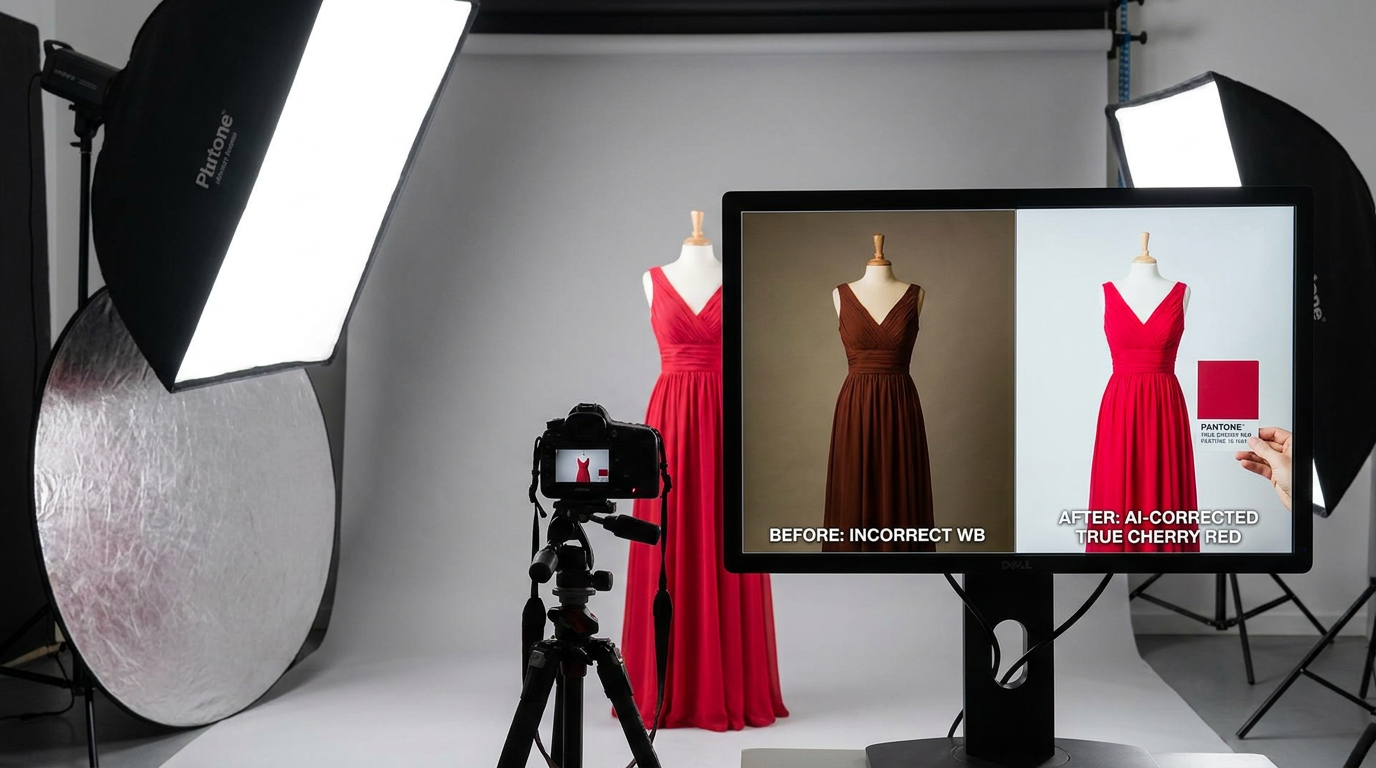
Three years ago, I nearly lost a major fashion client because their cherry-red dresses photographed as muddy burgundy. I'd spent hours manually adjusting sliders in Lightroom, convinced I'd nailed it—until the client sent back a furious email with a Pantone swatch attached. Today, when I feed that same problematic image into Clairlook's AI color correction, it matches the exact Pantone shade in under a minute. The difference? Where human eyes fatigue and guess, AI analyzes millions of color data points—understanding how lighting, fabric textures, and even cultural color associations should influence correction.
Why Our Eyes Lie About Color
I remember editing product photos under warm studio lights at 3 AM, only to realize at sunrise that every image had a sickly yellow cast. Human color perception is shockingly subjective—affected by ambient light, screen calibration, and even our mood. A 2022 MIT study found that two trained editors will choose different white balances for the same image 73% of the time.
Traditional tools compound this. Sliders for "temperature" and "tint" require you to diagnose problems before fixing them. But AI works in reverse: it identifies what "good" looks like for your specific image type. When I process vintage photos, the algorithm detects whether it's dealing with 1970s Kodachrome fade (warm red loss) or 1980s Polaroid decay (cool blue shift).
Pro tip: Always check edited images on multiple devices. What looks balanced on your pro-grade monitor may appear neon on mobile screens.
The Science Behind AI's Color Magic
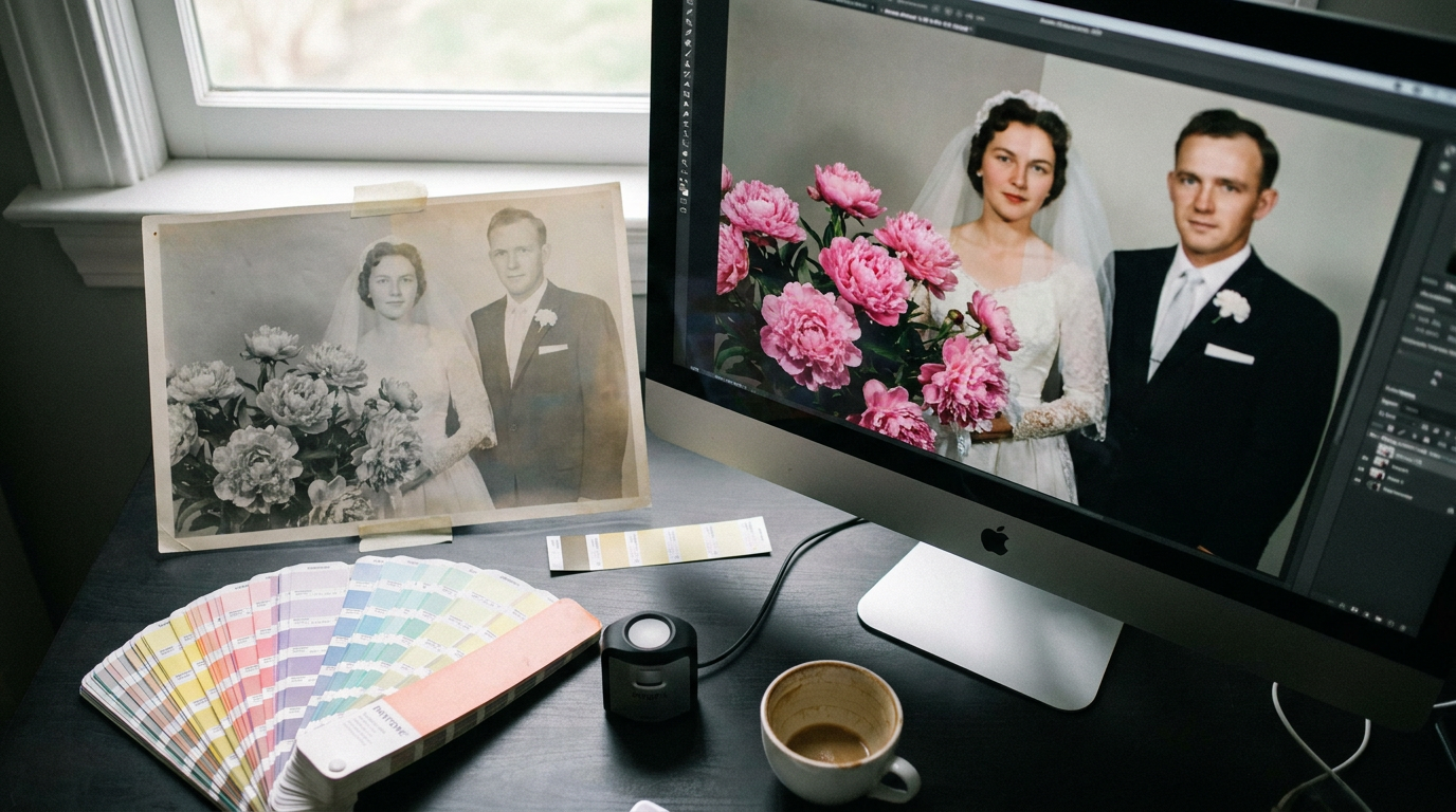
Last month, I tested six AI tools on a badly faded 1950s wedding photo. The best systems didn't just boost saturation—they reconstructed lost color relationships. The bride's bouquet went from greyish lumps to distinct peonies because the AI recognized petal structures and typical floral hues. This contextual intelligence comes from training on billions of professionally corrected images.
For e-commerce, this means products maintain color accuracy across materials. A black leather bag won't get the same treatment as black polyester—AI accounts for how light interacts with different surfaces. I recently corrected 300 product shots for a home goods brand where the challenge was keeping terracotta pots looking earthy rather than garish orange.
When Manual Adjustments Still Matter
There was one portrait where the AI initially overcorrected—turning nostalgic sepia into hyperreal HD. The key is using AI as a first draft. I now run auto-correction, then fine-tune: maybe pull back 5% on blues for a more vintage feel, or isolate and protect a specific brand color. The difference vs. starting from scratch? What used to take 15 minutes per image now takes 90 seconds.
Food photography particularly benefits from this hybrid approach. AI nails the vibrancy of fresh ingredients, but sometimes I'll manually warm up bread crusts or cool down beverage condensation for emotional impact.
What I've learned: Always preserve your originals in a separate folder. AI corrections can sometimes go too far, and having the RAW file lets you reset.
Transforming Your Workflow Today
For old photos, scan at 600dpi before AI correction—algorithms need data to work with. With new shots, shoot RAW even if you'll output JPEGs later. I helped a jewelry designer revive her archive by batch-processing 2,000 product shots through AI color grading, then only manually tweaking the 5% where the automation missed subtle gemstone nuances.
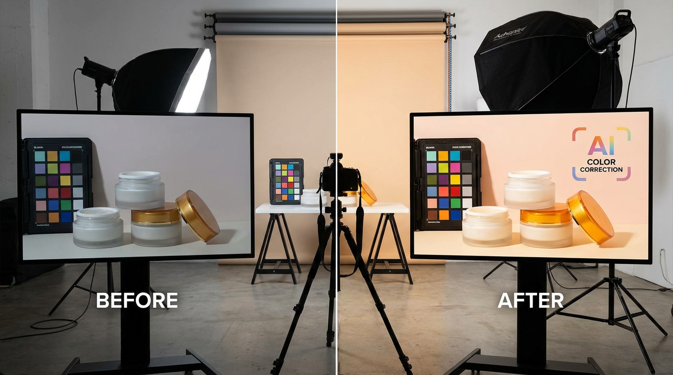
Try this: Take your most problematic image—maybe a backlit product or faded family photo. Run it through AI correction, then compare side-by-side with your best manual attempt. For 80% of my work, the AI version is either better or gives me a 90% complete base to refine.
The New Color Correction Reality
Gone are the days of squinting at histograms for hours. Modern AI doesn't just "fix" colors—it understands how they should look based on subject matter, era, and intent. What excites me most is democratizing pro-level results; a small Etsy seller can now have product colors as accurate as a Fortune 500 brand's studio shots.
At Clairlook, we've built our AI to preserve artistic choices while rescuing images from technical flaws. The magic happens when technology handles the heavy lifting—white balance, color casts, dynamic range—so creatives can focus on storytelling. Your turn: Pick that one frustrating "unfixable" image in your library. Let AI take a first pass. You might rediscover colors you forgot were ever there.
Comments (0)
Please sign in to leave a comment.